

Introducción - Introduction
Español
La aplicación es una plataforma de compras que muestra una lista de productos con descuento. Los usuarios pueden navegar por la lista de productos en la pantalla de inicio ("Home") y ver los detalles de un producto específico en la pantalla de detalles ("Details"). La aplicación utiliza animaciones y transiciones compartidas para mejorar la experiencia del usuario al explorar los productos.
English
The application is a shopping platform that displays a list of discounted products. Users can browse the list of products on the home screen ("Home") and view the details of a specific product on the details screen ("Details"). The application utilizes animations and shared transitions to enhance the user experience when exploring the products.
Código - Code
index.d.ts
interface Product {
    id: string;
    name: string;
    imageUrl: string;
    originalPrice: number;
    discountPrice: number;
    offerPercentage: number;
    rating: number;
    ratingCount: number;
    tags: string[];
}
Español
Interfaz Producto: La interfaz Producto define la estructura de un objeto que representa un producto. Contiene las siguientes propiedades:
id: Una cadena que representa el identificador único del producto.
name: Una cadena que almacena el nombre del producto.
imageUrl: Una cadena que contiene la URL de la imagen del producto.
originalPrice: Un número que representa el precio original del producto.
discountPrice: Un número que indica el precio con descuento del producto.
offerPercentage: Un número que representa el porcentaje de descuento ofrecido en el producto.
rating: Un número que representa la calificación del producto.
ratingCount: Un número que indica la cantidad de calificaciones que ha recibido el producto.
tags: Un array de cadenas que almacena las etiquetas asociadas al producto.
English
Product Interface: The Product interface defines the structure of an object representing a product. It contains the following properties:
id: A string representing the unique identifier of the product.
name: A string storing the name of the product.
imageUrl: A string containing the URL of the product's image.
originalPrice: A number representing the original price of the product.
discountPrice: A number indicating the discounted price of the product.
offerPercentage: A number representing the percentage of discount offered on the product.
rating: A number representing the rating of the product.
ratingCount: A number indicating the count of ratings the product has received.
tags: An array of strings storing the tags associated with the product.
data/constants.ts
export const PRODUCTS_LIST: Product[] = [
{
id: '1',
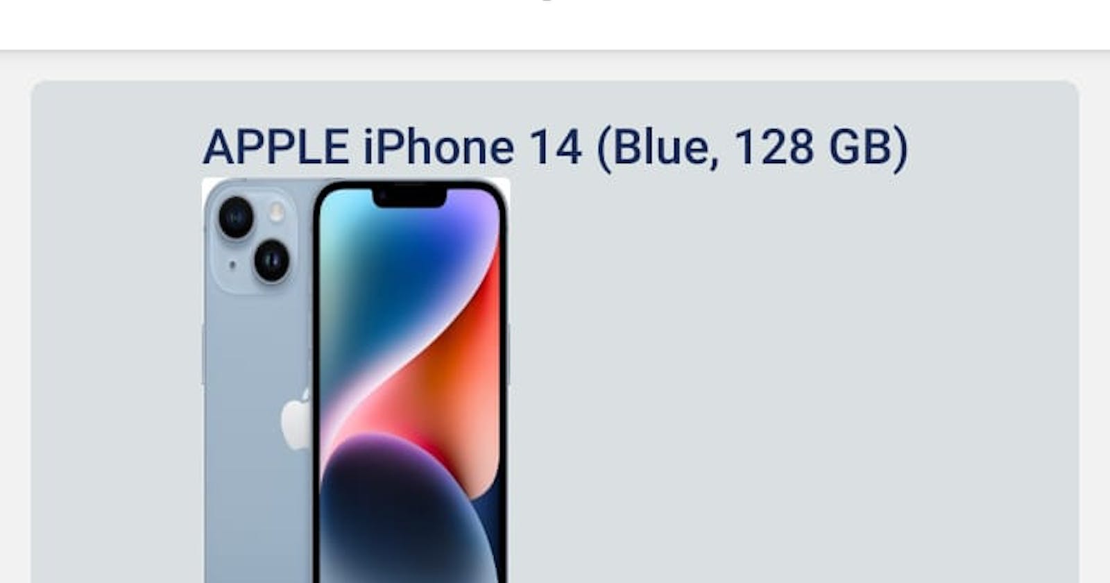
name: 'APPLE iPhone 14 (Blue, 128 GB)',
imageUrl:
'https://rukminim1.flixcart.com/image/300/400/xif0q/mobile/3/5/l/-original-imaghx9qmgqsk9s4.jpeg',
originalPrice: 79990,
discountPrice: 65999,
offerPercentage: 17,
rating: 4.7,
ratingCount: 8794,
tags: [
'12MP Front Camera',
'12MP Dual Rear Camera',
'15.49 cm (6.1 inch) Super Retina XDR Display',
],
},
{
id: '2',
name: 'APPLE iPhone 14 (Starlight, 256 GB)',
imageUrl:
'https://rukminim1.flixcart.com/image/300/400/xif0q/mobile/m/o/b/-original-imaghx9qkugtbfrn.jpeg',
originalPrice: 89900,
discountPrice: 75999,
offerPercentage: 15,
rating: 4.7,
ratingCount: 8794,
tags: ['12MP Front Camera', '15.49 cm (6.1 inch) Super Retina XDR Display'],
},
{
id: '3',
name: 'APPLE iPhone 14 (Purple, 128 GB)',
imageUrl:
'https://rukminim1.flixcart.com/image/300/400/xif0q/mobile/b/u/f/-original-imaghxa5hvapbfds.jpeg',
originalPrice: 79990,
discountPrice: 66999,
offerPercentage: 16,
rating: 4.7,
ratingCount: 8794,
tags: ['12MP Dual Rear Camera', '15.49 cm Super Retina XDR Display'],
},
{
id: '4',
name: 'APPLE iPhone 11 (White, 64 GB)',
imageUrl:
'https://rukminim1.flixcart.com/image/300/400/k2jbyq80pkrrdj/mobile-refurbished/k/y/d/iphone-11-256-u-mwm82hn-a-apple-0-original-imafkg25mhaztxns.jpeg',
originalPrice: 43900,
discountPrice: 38999,
offerPercentage: 11,
rating: 4.6,
ratingCount: 180810,
tags: [
'12MP Front Camera',
'12MP Dual Rear Camera',
'15.49 cm (6.1 inch) Super Retina XDR Display',
],
},
];
Español
Archivo de Productos: El archivo exporta una constante llamada PRODUCTS_LIST, que es un array de objetos que siguen la estructura definida por la interfaz Producto. Cada objeto representa un producto con propiedades como id, nombre, imageUrl, originalPrice, discountPrice, offerPercentage, rating, ratingCount y tags. Estos objetos contienen información detallada sobre varios modelos de iPhone de Apple, incluyendo detalles como el color, capacidad de almacenamiento, precios originales y con descuento, porcentaje de descuento, calificación y etiquetas asociadas.
English
Product File: The file exports a constant named PRODUCTS_LIST, which is an array of objects that adhere to the structure defined by the Product interface. Each object represents a product with properties such as id, name, imageUrl, originalPrice, discountPrice, offerPercentage, rating, ratingCount, and tags. These objects contain detailed information about various models of Apple's iPhone, including details such as color, storage capacity, original and discounted prices, discount percentage, rating, and associated tags.
components/ProductItem.tsx
import { Image, StyleSheet, Text, View } from 'react-native';
import React, { PropsWithChildren, memo } from 'react';
import Animated, { SharedTransition, withSpring } from 'react-native-reanimated';
import { SafeAreaView } from 'react-native-safe-area-context';

type ProductItemProps = PropsWithChildren<{
  product: Product;
}>

const ProductItem = ({product}: ProductItemProps) => {
  const customTransition = SharedTransition.custom((values) => {
  'worklet';
  return {
    height: withSpring(values.targetHeight),
    width: withSpring(values.targetWidth),
    originX: withSpring(values.targetOriginX),
    originY: withSpring(values.targetOriginY),
  };
});
  return (
    <View>
      <View style={styles.container}>
          <View style={styles.content}>
            <View>
              <Text style={styles.name}>{product.name}</Text>
                <Animated.Image
                sharedTransitionTag={product.name}
                sharedTransitionStyle={customTransition}
                source={{ uri: product.imageUrl  }}
                style={styles.image}
                />
                <View style={styles.ratingContainer}>
              <Text style={styles.ratingText}>{product.rating} ⭐</Text>
                </View>
              <Text style={styles.ratingCount}>{product.ratingCount.toLocaleString()} </Text>
              <Text style={styles.originalPrice}>
                  ₹{product.originalPrice.toLocaleString()}
              </Text>
              <Text style={styles.discountPrice}>
                  ₹{product.discountPrice.toLocaleString()}
              </Text>
              <View style={styles.offerContainer}>
                <Text style={styles.offerPercentage}>
                    %{product.offerPercentage} off
                </Text>
             </View>
            </View>
          </View>

      </View>
    </View>
  )
}


const styles = StyleSheet.create({
  container:{
    paddingVertical: 2,
    paddingHorizontal: 2,
    margin: 8,
    marginBottom: 4,
  },
  content: {
    flex: 1,
    flexDirection: 'row',
    alignItems:'flex-end',
    justifyContent:'center',
    marginBottom: 3,
    backgroundColor: '#DAE0E2',
    padding: 10,
    borderRadius: 5,
    borderColor: '#AE1438',
    borderStyle:'solid',
  },
  image: {
    width: 100,
    height: 160,
    alignSelf: 'stretch',
    resizeMode:'stretch',
    padding: 5,
    borderRadius:2,
  },
  name: {
    fontSize: 16,
    fontWeight: '600',
    color: '#192A56',
  },
  ratingContainer: {
    width:50,
    height:50,
    backgroundColor: '#25CCF7',
    borderRadius:50/2,
    alignItems:'baseline',
    justifyContent:'center'
  },
  priceContainer: {
    marginBottom: 12,
  },
  ratingText: {
    color: '#333945',
    fontSize: 15,
    fontWeight: '600',
    },
    ratingCount: {
      color: '#192A56',
      fontWeight:'600'
    },
    originalPrice: {
      fontSize: 18,
      marginRight: 4,
      fontWeight: '600',
      color: 'rgba(0, 0, 0, 0.5)',
      textDecorationLine: 'line-through',
    },
    discountPrice: {
      fontSize: 18,
      marginRight: 4,
      fontWeight: '600',
      color: '#000000',
    },
    offerContainer:{
    width:'auto',
    height:'auto',
    backgroundColor: '#25CCF7',
    borderRadius:5,
    alignItems:'baseline',
    justifyContent:'center'
    },
    offerPercentage: {
      fontSize: 17,
      fontWeight: '600',
      color: '#192A56',
    },
  })

  export default memo(ProductItem);
Español
El código proporcionado es un componente de React Native llamado ProductItem. Este componente toma un objeto product como propiedad y renderiza la información del producto, incluyendo el nombre, imagen, calificación, precios y porcentaje de descuento. Utiliza estilos definidos en el objeto styles para presentar la información de manera visualmente atractiva. Además, hace uso de la biblioteca react-native-reanimated para crear una transición compartida personalizada alrededor de la imagen del producto.
El componente utiliza elementos como View, Text, Image, y Animated de React Native para estructurar y mostrar la información del producto de manera visualmente atractiva.
English
The provided code is a React Native component called ProductItem. This component takes a product object as a prop and renders the product information, including the name, image, rating, prices, and discount percentage. It uses styles defined in the styles object to visually present the information. Additionally, it makes use of the react-native-reanimated library to create a custom shared transition around the product image.
The component utilizes elements such as View, Text, Image, and Animated from React Native to structure and visually present the product information in an appealing manner.
components/Separator.tsx
import { StyleSheet, Text, View } from 'react-native';
import React from 'react';

const Separator = () => {
  return (
    <View style={styles.separator}>
    </View>
  );
};
const styles = StyleSheet.create({
    separator: {
        height: 0.9,
        backgroundColor: '#DAE0E2',

    }
});

export default Separator;
Español
El código proporcionado es un componente de React Native llamado Separator. Este componente no toma ninguna propiedad y simplemente renderiza un separador visual utilizando un View con un estilo específico definido en el objeto styles. El separador tiene una altura de 0.9 y un color de fondo de '#DAE0E2'.
English
The provided code is a React Native component called Separator. This component does not take any props and simply renders a visual separator using a View with a specific style defined in the styles object. The separator has a height of 0.9 and a background color of '#DAE0E2'.
screens/Home.tsx
import { FlatList, Pressable, StyleSheet, Text, View } from 'react-native';
import React , {memo} from 'react';


// React Navigation
import {NativeStackScreenProps} from "@react-navigation/native-stack";
import {RootStackParametersList} from "../App";

import ProductItem from '../components/ProductItem';
import Separator from '../components/Separator';

// data
import { PRODUCTS_LIST } from '../data/constants';


type HomeProps = NativeStackScreenProps<RootStackParametersList, "Home">


const Home = ({navigation}: HomeProps) => {

  return (
      <View style={styles.container}>
        <FlatList
          data={PRODUCTS_LIST}
          keyExtractor={item => item.id}
          ItemSeparatorComponent={Separator}
          renderItem={({item}) => (
            <Pressable
              onPress={() =>{
                navigation.navigate('Details', {
                  product: item
                })
              }}
            >
              <ProductItem product={item}/>
            </Pressable>
          )}
        />
      </View>

  )
}

const styles = StyleSheet.create({
  container: {
    flex: 1,


  },
});

export default memo(Home);
Español
El código proporcionado es un componente de React Native llamado Home. Este componente utiliza un FlatList para renderizar una lista de productos. Cada elemento de la lista se representa utilizando el componente ProductItem y se separa visualmente utilizando el componente Separator. Además, se utiliza el componente Pressable para manejar la navegación a la pantalla de detalles cuando se presiona un elemento de la lista.
El componente Home toma la propiedad de navegación y utiliza la estructura de navegación proporcionada por React Navigation para manejar la transición a la pantalla de detalles cuando se presiona un producto en la lista.
English
The provided code is a React Native component called Home. This component uses a FlatList to render a list of products. Each item in the list is represented using the ProductItem component and visually separated using the Separator component. Additionally, the Pressable component is used to handle navigation to the details screen when an item in the list is pressed.
The Home component takes the navigation prop and utilizes the navigation structure provided by React Navigation to handle the transition to the details screen when a product in the list is pressed.
screens/Details.tsx
import { Image, ScrollView, StyleSheet, Text, View, useWindowDimensions } from 'react-native';
import React from 'react';

// React Navigation
import {NativeStackScreenProps} from "@react-navigation/native-stack";
import {RootStackParametersList} from "../App";
import Animated, { SharedTransition, withSpring } from 'react-native-reanimated';
import withTiming from 'react-native-reanimated';

type DetailsProps = NativeStackScreenProps<RootStackParametersList, "Details">

const Details = ({route}: DetailsProps) => {
  const {product} = route.params;

   const customTransition = SharedTransition.custom((values) => {
  'worklet';
  return {
    height: withSpring(values.targetHeight),
    width: withSpring(values.targetWidth),
    originX: withSpring(values.targetOriginX),
    originY: withSpring(values.targetOriginY),
  };
});

  return (
    <ScrollView style={styles.container}>
      <View>
        <Animated.Image
        sharedTransitionTag={product.name}
         sharedTransitionStyle={customTransition}
        style={styles.image}
        source={{uri: product.imageUrl }}  />
        <View>
            <Text style={styles.name}>{product.name}</Text>

            <View style={[styles.rowContainer, styles.ratingContainer]}>
                <View style={styles.rating}>
                    <Text style={styles.ratingText}>{product.rating} ⭐</Text>
                </View>
            <Text style={styles.ratingCount}>{product.ratingCount.toLocaleString()} </Text>
            </View>

            <View style={[styles.rowContainer, styles.priceContainer]}>
                 <Text style={styles.originalPrice}>
                    ₹{product.originalPrice.toLocaleString()}
                </Text>
                <Text style={styles.discountPrice}>
                    ₹{product.discountPrice.toLocaleString()}
                </Text>
                <Text style={styles.offerPercentage}>
                    %{product.offerPercentage} off
                </Text>
            </View>
            {product.tags.map((tag, index) => (
              <View key={index} style={styles.badge}>
                <Text style={styles.tagBadge}>{tag}</Text>
              </View>
            ))}
        </View>
      </View>
    </ScrollView>
  )
}

const styles = StyleSheet.create({
  container: {
    paddingHorizontal: 18,
    backgroundColor: '#FFFFFF',

  },
  image: {
    width: 300,
    height: 450,
    resizeMode: 'stretch',
    alignItems:'center',
    justifyContent:'center'
  },
  rowContainer: {
    flexDirection: 'row',
  },
  name: {
    marginBottom: 4,

    fontSize: 20,
    fontWeight: '500',
  },
  ratingContainer: {
    marginVertical: 12,
  },
  priceContainer: {
    paddingVertical: 12,
    paddingHorizontal: 12,

    marginBottom: 12,

    borderRadius: 6,
    backgroundColor: '#deffeb',
  },
  rating: {
    marginRight: 4,

    borderRadius: 4,
    paddingHorizontal: 8,
    justifyContent: 'center',
    backgroundColor: '#25CCF7',
  },
  ratingText: {
    color: '#fff',
    fontSize: 14,
    fontWeight: '600',
  },
  ratingCount: {
    fontSize: 14,
    color: '#878787',
  },
  originalPrice: {
    fontSize: 18,
    fontWeight: '600',
    marginRight: 8,

    color: 'rgba(0, 0, 0, 0.5)',
    textDecorationLine: 'line-through',
  },
  discountPrice: {
    fontSize: 18,
    color: '#000000',
    fontWeight: '600',
  },
  offerPercentage: {
    fontSize: 17,
    fontWeight: '600',
    color: '#4bb550',

    marginRight: 8,
  },
  badge: {
    margin: 2,
    flexWrap: 'wrap',
    flexDirection: 'row',
    backgroundColor:'#25CCF7',
    borderRadius: 4
  },
  tagBadge: {
    paddingVertical: 2,
    paddingHorizontal: 4,

    borderWidth: 1,
    borderRadius: 4,
    borderColor: 'rgba(0, 0, 0, 0.5)',

    color: 'rgba(0, 0, 0, 0.8)',
  },
});

export default Details
Español
El código proporcionado corresponde al componente Details de React Native. Este componente muestra los detalles de un producto individual, el cual recibe como propiedad a través de la navegación.
Renderiza la información del producto como el nombre, imagen, calificación, precios, porcentaje de descuento y etiquetas. Utiliza elementos como ScrollView, Image, Text y View para estructurar y mostrar la interfaz de forma atractiva. Además, hace uso de la biblioteca react-native-reanimated para crear una transición compartida personalizada alrededor de la imagen del producto.
El componente toma la propiedad de navegación para obtener el producto seleccionado. Estilos definidos en styles se encargan de maquetar los elementos de forma agradable para el usuario.
English
The provided code corresponds to the Details React Native component. This component displays the details of an individual product, which it receives as a prop through navigation.
It renders the product information such as name, image, rating, prices, discount percentage and tags. It uses elements like ScrollView, Image, Text and View to structure and display the interface attractively. Additionally, it utilizes the react-native-reanimated library to create a custom shared transition around the product image.
The component takes the navigation prop to obtain the selected product. Styles defined in styles are responsible for laying out the elements in a pleasant way for the user.
App.tsx
import { View, Text } from 'react-native';
import React from 'react';

// navigation
import { NavigationContainer } from '@react-navigation/native';
import { createNativeStackNavigator } from '@react-navigation/native-stack';

// sreens
import Home from './screens/Home';
import Details from './screens/Details';


export type RootStackParametersList = {
  Home: undefined;
  Details: {product: Product}
}

const Stack = createNativeStackNavigator<RootStackParametersList>()

const App = () => {
  return (
    <NavigationContainer>
      <Stack.Navigator initialRouteName='Home'>
      <Stack.Screen
        name='Home'
        component={Home}
        options={{
          title: "Discounted smartphones",
          animation: 'slide_from_left',

        }}
      />
      <Stack.Screen
        name='Details'
        component={Details}
        options={{
          title: "Smartphone Details",
          animation: 'slide_from_bottom',

        }}
      />
      </Stack.Navigator>
    </NavigationContainer>
  )
}

export default App
Español
El código proporcionado es la configuración de navegación de la aplicación utilizando React Navigation. Se definen dos pantallas: "Home" y "Details", las cuales corresponden a las pantallas de inicio y detalles de la aplicación. Se utiliza createNativeStackNavigator para crear un stack de navegación nativa que contiene estas dos pantallas. Cada pantalla tiene opciones específicas, como el título y la animación de transición.
La pantalla "Home" muestra una lista de productos, mientras que la pantalla "Details" muestra los detalles de un producto específico. La navegación entre estas pantallas se gestiona utilizando React Navigation.
English
The provided code is the navigation setup of the application using React Navigation. Two screens are defined: "Home" and "Details", corresponding to the home and details screens of the application. createNativeStackNavigator is used to create a native navigation stack containing these two screens. Each screen has specific options such as title and transition animation.
The "Home" screen displays a list of products, while the "Details" screen shows the details of a specific product. Navigation between these screens is handled using React Navigation.
GitHub
https://github.com/jotalexvalencia/shopsmart